pretty organized

I was reading a magazine during one of my library desk shifts the other day.  As long as I don’t snap bubblegum while I read, no one thinks it’s inappropriate: in a library context any engagement with print looks legitimate.  (Best job ever!)  I even learned something while I read.  One of the magazine’s suggestions for getting an area organized was to make it attractive.

That’s a principle I’ve followed from the beginning with my desk. I always have three or four things going on here, but I try to at least keep each project stacked in its own region.  Right now I’m organizing recipes, procrastinating art-framing that’s needed to happen for a couple months now, editing a memoir for a friend’s grandma, writing a letter (to you, Natalie R.!), and thinking about revamping several binders where I keep things like our lease, party ideas, and my own writing.

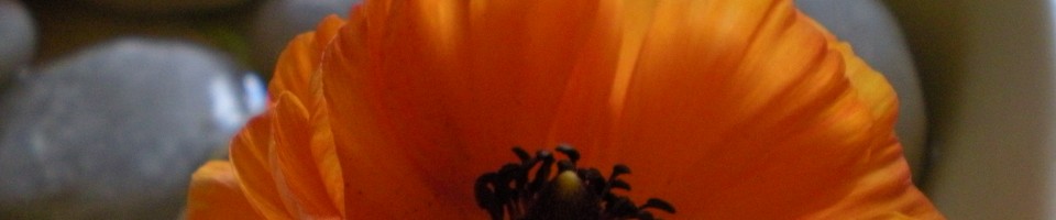
As I mentioned in Monday’s post, even the tiniest dose of floral makes a space lovely, so when I started trying to whip my desk into shape for the new year I brought home these spray roses to keep me company.

soft pink roses in hobnail milk glass vase

They’ve long since faded out, so I turned to changing up the gallery wall.  My original layout was this:

desk art wall June 2012

For all the details click here. Though “ultra-feminine” probably wouldn’t be the first adjective my friends would choose to describe my aesthetic, wherein pink is almost always absent, for some reason my desk has become an outlet for all my girly impulses. The second iteration was even softer than the first, albeit without the pink:

desk wall art February 2013

This time I decided I wanted something more energetic.  I wanted vibrant color and inspiring images to “wow” me when I looked at the wall.  The other arrangements staled for me because I got to where I didn’t even notice them.  I think that danger is now averted.

primary-color wall art over desk

The criteria for inclusion on this wall were a.) personally meaningful or b.) brightly colored.  I started with red-orange and royal blue, then yellow, purple, and teal found their way in so I suppose it’s inaccurate to say there’s a color scheme.  But there’s color!

I even updated my desktop image to go along with everything else.  That’s a beach in Kauai.  I hope to be there–or somewhere nearby–for our next vacation.  (It’s been a dream of Lovey’s and mine since our honeymoon in Missouri; I’m sure you can imagine.)  Here are a few of the other mementos:

"choosing tomatoes" card from best friend

A card my bestie sent me in the mail; inside it says “You’re good for me.”  I’m grateful for all her friendship has seen me through, and the card brings forth those warm feelings.  (Love you!)

"wiggle your worries" saying

This one came from an Oprah magazine (library again–but I ripped it out of a free copy, not a circulating copy!).  It says, “Wiggle your worries a little each day, and they’ll gradually lose their hold.”  Like first graders’ teeth.  It doesn’t say that–but that’s what I think of.  Get those worries looser and looser til they pop out and something mature takes their place.

little girl on teeter-totter

This photo of little me goes along with the “no worries” saying.  In childhood we are unselfconscious and endlessly creative, and I’m sure there’s a link.

creativity within confinement

And going along with that is a reflection on a lightbulb in a box–it reminded me of a concept I learned from one of my favorite creative writing teachers: that inspiration often strikes hardest when you discipline yourself.  For example, he challenged us to learn to write sonnets well before moving on to free verse poetry.  By striving to condense an idea to fit a rigid structure, we trained ourselves to pay attention to every detail, and therefore not to waste words when we were unfettered in a looser format.

photo booth Lovey & meAnd then there’s this.  I thought I had lost it, and I was sad about losing it–but then I found it!  It was hiding behind “Tally Ho!”, which is  the art that used to hang where “Wiggle your worries” is now.  Better view of “Tally Ho” here, if you care (scroll to the bottom).

Even a small effort at mixing things up keeps the look fresh and fun.  And a small effort at imposing order keeps the look in line.  The wall now seems to affirm all my highest aspirations for this space: whatever I create will be orderly, inspired, and colorful under the watchful eye of this array.  That’s the only possible outcome here.  Right?

What are your favorite ways to reclaim a cluttered space or infuse a ho-hum area with some punch?

actual pinspiration

I like Pinterest as much as the next girl.  Well…maybe not quite as much.  I try to restrain myself by limiting my pins only to things I truly intend to try, or at least use as a mood board for a project.  But today I decided to go old-fashioned and use actual straight pins to stick paper scraps to my giant fabric-covered board.

bulletin board lying on desk

I updated the quotation on my chalkboard to say, “Change is a direct result of our plans,” from the Sleeping at Last song “Land or Sea.”  (If you haven’t heard their “Yearbook” album do yourself a favor and get on that.)  The quotation seemed appropriate as a reminder and caption to my visual inspirations, which you’ll see here in one second….

magazine images pinned to bulletin board

A calendar from the flower shop hangs at the top–I pounded a nail into the wooden frame to hold the calendar’s weight.  Under that  are several magazine cutout/tearouts of patterns, colors, and rooms I like.  They’re my inspiration as I continue to add to the living room and begin on the bedroom.

Everything is very boldly colored, warm, textile-rich, and at least a bit global.  I love the look of layers of texture, color, and pattern, but I’m still figuring out how to create coherence from variety.

This wall is a starting place, I guess, and not just because of the bulletin board!

gallery wall above desk

I changed a bit of the art to balance the wall after cramming my board with pictures.  First I framed the front of a handmade card from my college roommate+penpal+sweet friend, Molly.

taping card to paper backing to frame it  Molly's heart art hanging

The note written on the other half of the card is hiding behind the matting paper.  Next I framed a drawing of a cake that I painstakingly snipped out of a Bon Appetit magazine.  The slogan “the sweet life” came from an ad in the same magazine, I think.

cake drawn in b&w with pink background and pink slogan "the sweet life"

The map of Elizabethan England moved over from its original spot on the left.  (Molly’s heart art hangs where the map used to be.)  Under the map is this little jotted card that says, “DREAM WITH ME.  Hawaii.  San Diego.  cruise.  S.A.L. concert. COME AWAY WITH ME.”

framed come away with me card

As Lovey and I have begun to glimpse the end to this season of our life (with him in school), we’ve started to dream bigger dreams for the future.  These places & activities top our list of things we want to experience together.  We’re already scheming to make one of them a reality, but probably not until next year.

desk, gallery wall, open laptop

So there you have it.  All spiffed up and ready for some work to be done.  As I cleaned I unearthed some tidbits I’ve saved to turn into handmade cards, so that will be one of the first projects I spread out all over this newly tidied space.  How do you control clutter on your desk?  And do you have any technology-free ways of keeping inspiration before your eyes?  I’d love to hear your ideas!

perfectly imperfect

I finally found the decorating book that describes my style: The Perfectly Imperfect Home by Deborah Needleman.  You might recognize her name if you read Domino magazine: she was its founding editor.  I glanced at the book a while back while checking in holds for library patrons.  Because I couldn’t take home the book right then (it being on hold and all), I flicked through it and gleaned one new-to-me idea that I implemented as soon as I got home.

red spray roses

{Pattern and color infuse rooms with vivacity.}

Now I’ve had the chance to read and admire the book from cover to cover.  I love the tone–conversational yet authoritative.  I think confidence probably makes up 80% of decorating style (the other 20%  coming from actual knowledge about things like color theory, proportion, and lighting).  This girl seems to have both confidence and knowledge in spades.

Deborah Needleman's "Perfectly Imperfect Home" book

{Finally got my hands on it for a while!}

She has cute terms for elements of home decor, such as “jollifiers” (children’s art falls into this category); “mollifiers” (junk we tolerate because our loved ones love it); and “smalls” (“…those precious little objects that are the grown-up versions of the toads and stones and broken sticks and bits of gathered string that we stuffed into our pockets as children.  Nothing can add vitality to a room or clutter the hell out of it more than one’s smalls” p. 186).  Amen to that, which is why I’m fairly anti-knickknack.

This book explains why I love calculated mismatch.

view of living room from dining room

{I want to add even more patterns to this room; I’m not afraid anymore.}

Why I thrill at the sight of even a couple stems of flowers greeting me from the table.

alstroemeria

{Pink alstroemeria, which I actually purchased from the flower shop. Lasts for weeks–it’s a great buy!}

Why home decor doesn’t have to cost much to create an embracing space.

desk made from two bookshelves and a door

{This desk consists of two $15 bookshelves and a $10 door.}

And why, after all we pour into the process, the best part of decorating a home is living there.

Lovey reading on the couch

{Lovey reading on the couch}

What touches make your home a haven?  Do you get the most satisfaction from successes such as finding the perfect piece of furniture or serendipities such as scribbled masterpieces from the littlest loved ones in your life?